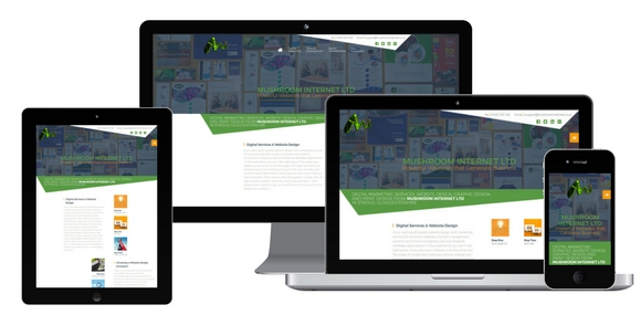
Responsive design improves your website’s appearance on mobile phones and tablets. It means coding your website in a different way to standard. It takes longer and cost more, but it’s far cheaper than building a separate website for mobiles.
If you take our website and slowly re-size the browser window, you will see how the page morphs and changes as the width of the page narrows. Some items on the page are repositioned, removed or in some cases added in order to make a website that is as easy to read and search on a phone as it is from your desktop. Our Gloucestershire based website design team have over 10+ years experience in designing websites to the highest standards.

In essence the page is created in blocks that relay themselves to fit the available screen size. We swap logos, make horizontal menus become vertical, and re-size graphics as part of the process so different images are displayed at different screen sizes. Text blocks are re-laid and stacked on top of each other rather just shrinking and making you use the zoom function in order to read the text. Have you tried flicking across a zoomed in screen on a Blackberry?